
marketing Jun 19, 2026
Brand Design Presentation - Client-Winning Guide

A designer opens a new brand project with full excitement. The designer starts shaping ideas fast. They sketch logo options, test color palettes, explore fonts, collect mockups, and save visual references one after another. But then comes the real problem: how do you turn all of that creative energy into a clear concept the client can understand? This is where many brand presentations fall flat. They show too many logo options, random mockups, and pretty visuals without a strong reason behind them. The client feels confused, and the designer ends up defending the work instead of guiding the conversation. That is what this guide helps with. It shows how to clarify the client’s goals, choose only the strongest logo concepts, build useful brand elements, and present the idea like a story. BriefCab makes this process easier by helping designers shape scattered ideas into a clean, focused brand pitch. Present your brand concepts with more confidence. Use BriefCab to turn creative ideas into client-ready presentations.
What Should you Clarify Before you Create Brand Concepts?
Before you start designing brand concepts, slow down and ask the right questions. A strong brand idea is not just “a nice logo.” It should solve a real business problem.
In my experience, the best concepts come when the designer understands the client deeply, not when they jump straight into visuals.
Define the Client’s Goals and Audience
Start with the basics:
-
What does the client want to achieve?
-
Who are they trying to attract?
-
What should people feel when they see the brand?
-
What problems does the audience care about?
For example, a skincare brand for Gen Z will not need the same tone as a premium legal firm. One needs energy and relatability. The other needs trust and authority.
Review Competitors and Visual References
Look at competitors, but do not copy them. This step helps you spot patterns and gaps. If every brand in the space uses soft beige, maybe a bold color can help your client stand out.
Set the Creative Direction with a Mood Board
A mood board keeps everyone aligned. It gives the client a clear feel before you spend hours on logos. I personally think this step saves projects from messy revisions later.
Why Should you Limit Logo Concepts to Three Options?
Showing too many logo concepts can confuse the client. In my opinion, three strong options are more than enough. Anything more usually means the designer has not filtered the ideas properly.
A client does not need to see every sketch. They need to see the best thinking.
Compare each Concept for Strategy, Style, and Use
Before presenting, compare each logo idea properly. Ask:
-
Does it match the brand goals?
-
Will it attract the right audience?
-
Does it feel different from competitors?
-
Can it grow into a full brand system?
For example, Nike’s swoosh works because it is simple, flexible, and full of movement. It is not just a mark. It has brand energy.
Test each Logo on Web, Print, and Social
A logo may look great on a big screen but fail as an Instagram profile icon. Test it everywhere:
-
Website header
-
Business card
-
Packaging
-
Social media profile
-
Mobile screen
Choose Concepts with Distinct Brand Potential
Do not show three versions of the same idea. Each concept should have its own personality. One might feel bold, one premium, and one playful. This helps the client make a real choice, not just pick a font.
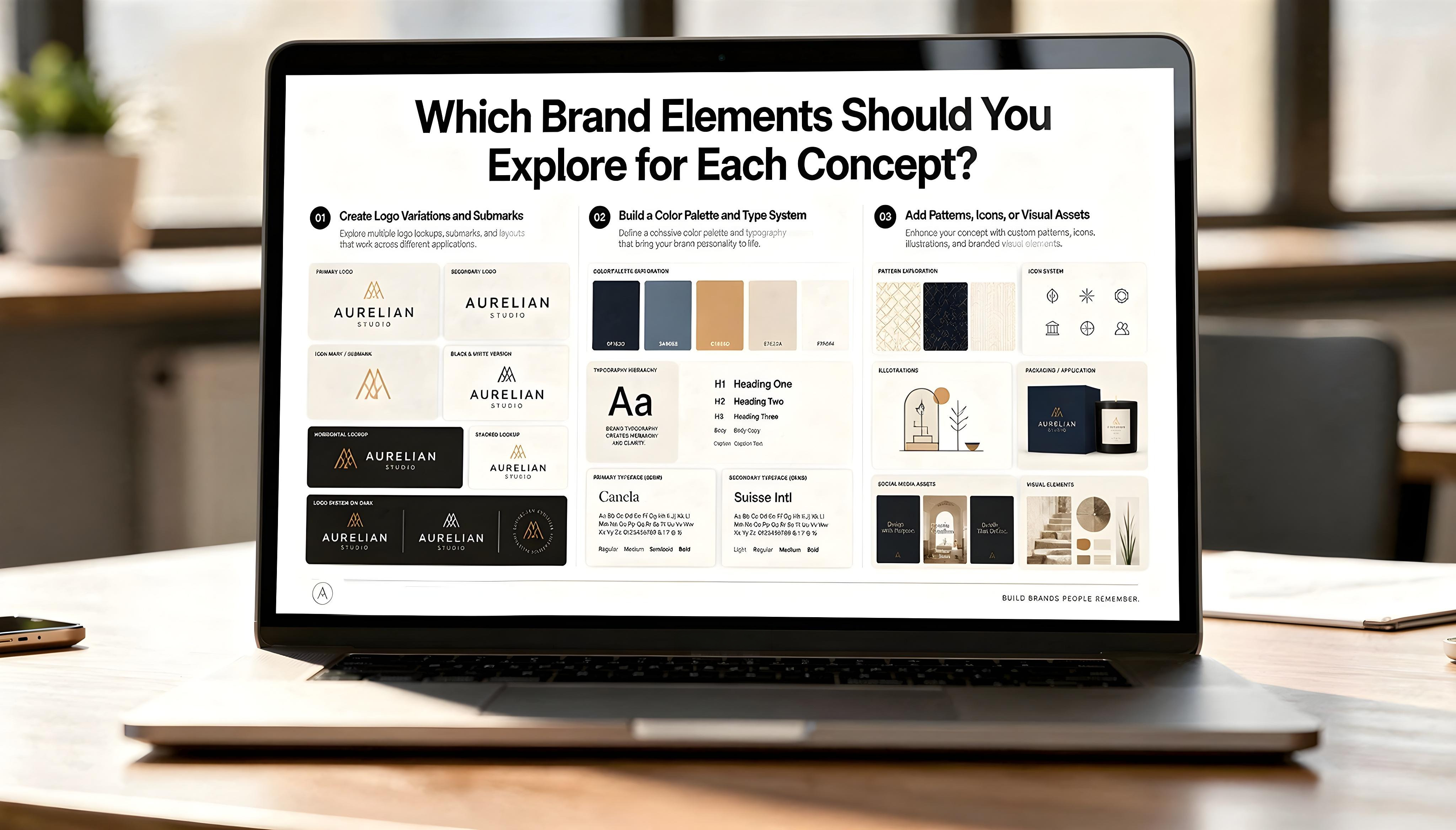 Which Brand Elements Should You Explore for Each Concept?
A logo concept should never sit alone. It needs a small brand world around it. This is where many presentations feel weak. They show a logo, but not how the brand could actually live in real places.
Create Logo Variations and Submarks
Start by building a few practical logo versions. This helps the client see flexibility, not just one polished mark.
-
Primary logo
-
Secondary logo
-
Icon or submark
-
Black and white version
-
Horizontal and stacked layouts
Think of brands like Starbucks or Apple. Their main logos are strong, but their simplified marks work just as well in tiny spaces.
Build a Color Palette and Type System
Color and typography give the concept its mood. A serif font can feel premium. A rounded font can feel friendly. A bold color palette can make a small brand look more confident.
I always think this step reveals whether the concept has depth or is just a nice-looking logo.
Add Patterns, Icons, or Visual Assets
Add supporting assets only when they make sense. For example, a children’s brand may need playful icons. An outdoor brand may need textures, badges, or map-style patterns.
These extras help the client imagine the brand on packaging, websites, social posts, and real customer touchpoints.
Where Should You Use Mockups In A Brand Pitch?
Mockups are powerful, but only when they feel real. A brand pitch should not look like a random gallery of pretty templates. It should show how the identity will work in the client’s actual world.
Match Mockups To The Client’s Business Model
Choose mockups based on how the business operates.
-
A café may need cups, menus, signs, and packaging.
-
A SaaS brand may need website screens, dashboards, and social ads.
-
A fashion label may need tags, bags, lookbooks, and Instagram posts.
This sounds simple, but many designers still use vehicle mockups for brands that will never own a van. That weakens the pitch.
Show The Brand In Real Customer Touchpoints
Think about where customers will meet the brand first. Is it a homepage? A product box? A LinkedIn ad? A shop window?
For example, Airbnb’s brand works because it shows up consistently across app screens, photography, emails, and real travel moments.
Avoid Irrelevant Or Generic Scenes
Do not use mockups just to fill space. A clean business card mockup is fine, but it will not sell the full idea alone. Pick scenes that prove the concept can survive outside the presentation.
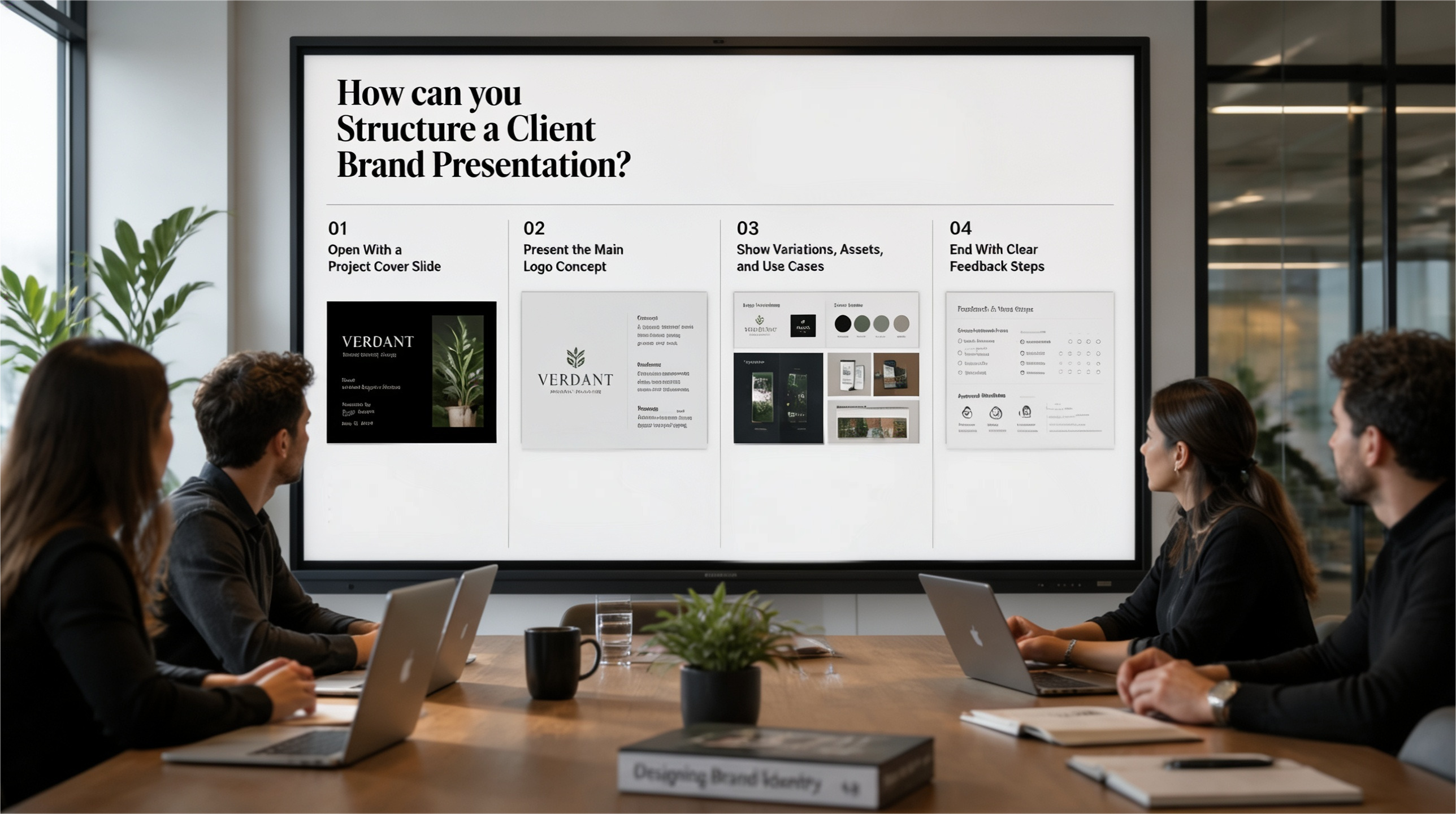 How can you Structure a Client Brand Presentation?
A brand presentation should feel like a guided story, not a folder of random designs. The client should understand why each idea exists and how it could work in the real world
Open With a Project Cover Slide
Start clean and simple. Add the project name, client name, and your studio or designer name. This sets a professional tone from the first slide. I also like adding one strong visual from the concept, so the deck feels branded straight away.
Present the Main Logo Concept
Show the main logo first before adding too many extras. Give a short reason behind the idea.
-
What inspired the concept?
-
How does it connect to the audience?
-
What feeling should it create?
This helps the client judge the logo by strategy, not just personal taste.
Show Variations, Assets, and Use Cases
Next, show how the brand can grow:
-
Logo variations
-
Submarks
-
Colors and fonts
-
Social posts
-
Packaging or web mockups
Think of this like showing the brand “in action.”
End With Clear Feedback Steps
Do not end the deck with silence. Tell the client what kind of feedback you need. Ask what feels strong, what feels off, and which direction they want to explore further.
Conclusion
A brand presentation often starts as a messy table of ideas. One logo feels bold. Another feels safe. A mockup looks beautiful, but no one knows if it belongs. The client looks through the deck, pauses, and quietly asks, “So, which direction is right?”
That moment is the real test. A strong presentation should not make the client work harder. It should guide them. It should show why the concept exists, how it connects to their audience, and where the brand can go next.
When you choose fewer logo concepts, use relevant mockups, and build a clear visual story, the pitch becomes more than a design review. It becomes a decision-making tool.
BriefCab helps designers reach that point faster. It turns scattered ideas into a focused brand story, so the client does not just see the design. They understand it.
And maybe that is what every good brand pitch should do: make the right choice feel obvious.
Ready to make your next brand pitch clearer and easier to approve?
Build it with BriefCab and help your client see the right direction faster.
Frequently Asked Questions (FAQs):
How Many Logo Concepts Should you Show a Client?
Show a maximum of three strong logo concepts, not every idea you created.
This keeps the client focused and helps them compare quality, strategy, and brand potential.
What Should a Brand Presentation Include?
A brand presentation should include the main logo, logo variations, colors, fonts, visual assets, and real use cases.
It should explain the thinking behind the design, not just show pretty visuals.
Should you Use Mockups in a Brand Presentation?
Yes, mockups help clients see how the brand will work in real life.
Use only relevant mockups, like packaging for a product brand or website screens for an online business.
How Do you Make a Brand Presentation Look Professional?
Keep the layout clean, use consistent spacing, and follow one clear visual style throughout.
Add a cover slide, simple explanations, strong mockups, and clear feedback steps at the end.